17 DIY Abstract Canvas Art Ideas for 2026
Creating abstract canvas art at home is a wonderful way to personalize your space, explore your creativity, and make decorations that reflect your taste. You don't need professional painting skills or expensive supplies to produce something beautiful. With a few colors, simple tools, and an open mind, you can turn an ordinary canvas into a unique piece of artwork.
Abstract painting gives you the freedom to experiment with shapes, movement, textures, and color combinations without worrying about creating a perfect picture. Whether you prefer understated neutral designs or expressive splashes of color, there are countless ways to develop a style that suits your home.
The secret is to start with a manageable idea and build your composition gradually. Experiment with different techniques, trust your creative instincts, and remember that unexpected brushstrokes can become the most interesting parts of your design.
Here are 14 DIY abstract canvas art ideas to inspire your next creative project.
1. Before You Start
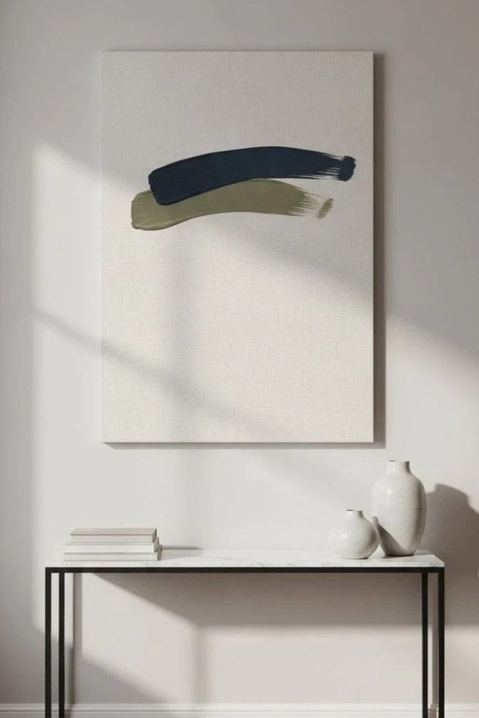
Gather your materials before opening your paint so you can concentrate on creating rather than searching for supplies halfway through the project.
A basic setup usually includes a stretched canvas, acrylic paints, a selection of brushes, a mixing palette, and a palette knife. Household items such as old plastic cards, sponges, and cardboard can also help you achieve different patterns and textures.
Think about your color scheme before you begin. Choosing three to five complementary shades makes it easier to maintain visual harmony while still allowing room for experimentation. Consider the colors already present in your room if you intend to display the finished artwork there.
You should also work in stages, allowing individual layers to dry when necessary. Combining opaque paint with thinner washes or adding texture between coats can give your canvas more depth. Protect your work surface, keep a cloth nearby for quick cleanup, and make sure the room has adequate ventilation.
2. Fluid Triptych
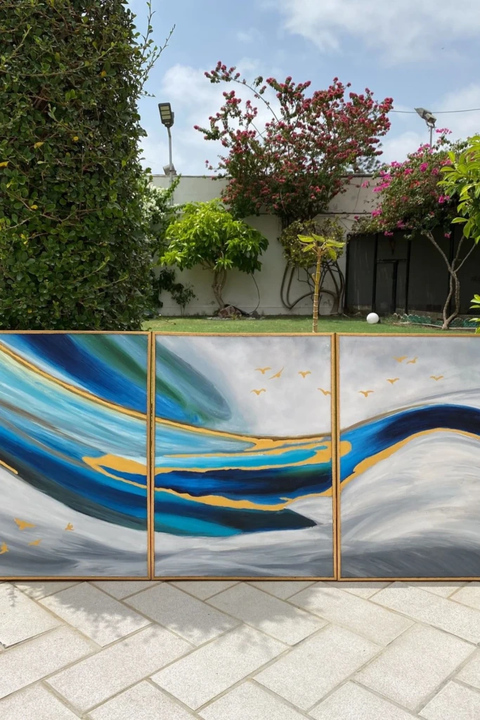
<PRIVATE_PERSON>Instead of creating a single oversized painting, try spreading one abstract composition across three individual canvases. This arrangement, known as a triptych, creates a connected visual effect while giving each panel its own character.
Begin by arranging the canvases side by side so you can plan how the colors and shapes will flow between them. Apply broad brushstrokes across the panels, allowing some elements to continue from one canvas to another. Add contrasting tones, curved marks, or subtle metallic details to make the design more dynamic.
A fluid triptych is especially effective above a sofa, bed, dining table, or long hallway console. Keep the gaps between the canvases consistent to maintain a cohesive appearance.
3. Botanical Texture
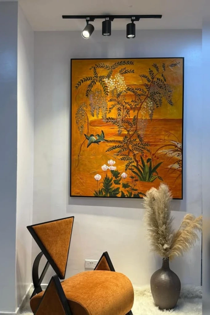
Bring the calming qualities of nature into your home with an abstract painting inspired by leaves, stems, and organic forms. Rather than reproducing a specific plant, focus on the shapes and textures associated with botanical elements.
Apply a neutral base coat, then use modeling paste to create raised patterns with a palette knife. Loose leaf-like marks, flowing curves, and irregular ridges can suggest natural growth without becoming overly detailed. Allow the textured surface to dry according to the product instructions before applying color.
Muted green, warm cream, terracotta, and soft brown create an earthy combination. For a more refined finish, lightly brush paint over the raised areas while leaving portions of the underlying texture exposed.
4. Color Blocking
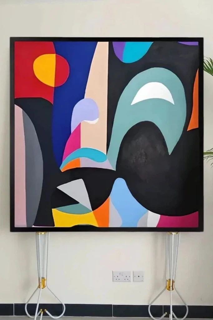
Color blocking is an accessible option for anyone who enjoys bold shapes and clean edges. The technique involves dividing a canvas into separate sections and filling each area with a distinct color.
Start by sketching a few geometric sections or positioning painter's tape to create straight boundaries. Paint each section with your chosen shade, experimenting with rectangles, triangles, and uneven blocks. A combination of one dominant color and several softer tones can make the arrangement feel balanced.
After the paint dries, carefully remove the tape. You can preserve the crisp boundaries for a modern appearance or add a few freehand marks to soften the overall design.
This style works particularly well in contemporary living rooms, creative workspaces, and minimalist interiors.
5. Textured Layers
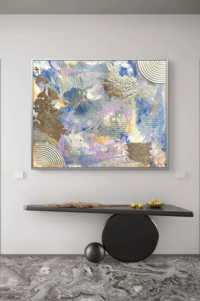
If you want artwork that feels as interesting as it looks, concentrate on building a richly textured surface. This approach uses the thickness and movement of the materials to create visual depth.
Spread modeling paste or heavy-body acrylic paint across the canvas using a palette knife, an old plastic card, or another suitable tool. Create sweeping curves, uneven ridges, and overlapping marks instead of repeating the same texture everywhere.
Once the first layer has dried, introduce additional colors through dry brushing or thin washes. Let some areas remain prominent while allowing others to blend into the background.
A small amount of metallic paint can emphasize raised details when the light hits the surface. Avoid covering every section equally, as variations in texture help the finished piece feel more expressive.
6. Linear Contrast
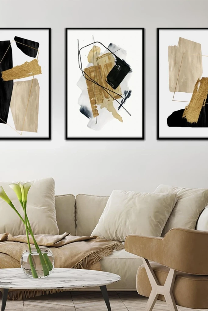
Combine a soft, understated background with strong lines to create artwork that feels modern and graphic. This technique relies on the relationship between delicate color transitions and confident marks.
Begin with a background of beige, cream, pale gray, blush, or another muted shade. You can blend several similar colors together or leave visible brushstrokes for added interest. Once the base is completely dry, introduce darker lines using a fine brush or acrylic paint pen.
Experiment with curved strokes, intersecting lines, and irregular geometric marks. Allow some lines to extend across the canvas while keeping other areas relatively empty.
The contrast between light and dark creates a clear focal point without requiring complicated imagery. This style pairs beautifully with simple furniture and neutral decor.
7. Gesture Lines
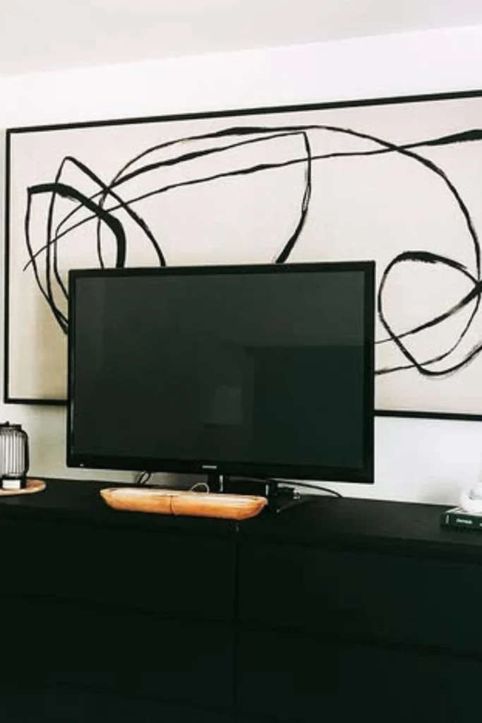
Gesture-line painting celebrates spontaneous movement rather than precise shapes. It is a good choice if you enjoy expressive artwork that feels relaxed and natural.
Choose a warm neutral background and let it dry before adding the main design. With a larger brush and a contrasting color, create broad, flowing lines that move across the canvas. Try using your shoulder and arm to guide the brush instead of relying entirely on small wrist movements.
You might experiment with loops, elongated curves, overlapping strokes, or a single continuous-looking line. The aim is to capture movement rather than produce perfect symmetry.
Leave enough open space for the main marks to stand out. A restrained composition often feels more powerful than one crowded with decorative details.
8. Micro Motifs
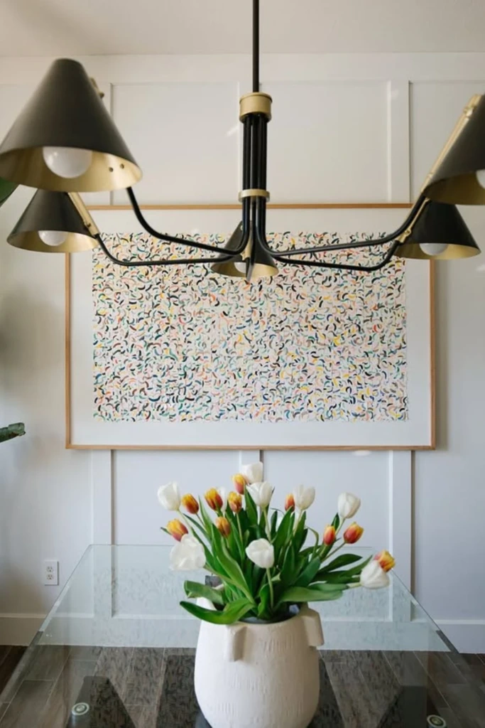
Repeated miniature shapes can transform a simple canvas into an intricate, playful piece of abstract art. Instead of relying on large painted areas, this method builds interest through numerous small details.
Select one or two basic motifs, such as dots, arches, short dashes, tiny waves, or irregular geometric shapes. Repeat them across the canvas, making small changes in their direction, size, or spacing to prevent the pattern from looking mechanical.
You can arrange the motifs in orderly rows or allow them to form loose clusters. A limited color palette will help the repeated elements feel connected, while an occasional contrasting mark can introduce variety.
This technique suits smaller canvases, colorful reading corners, children's creative spaces, and gallery walls. It is also a useful way to practice brush control and develop a consistent visual rhythm.
9. Sculpted Neutrals
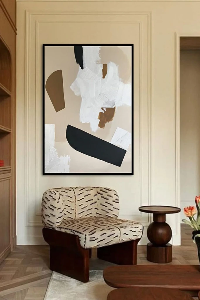
Neutral artwork can make a strong impression without relying on bright colors. Sculpted neutral canvas art emphasizes raised surfaces, subtle shadows, and the natural variation of handmade marks.
Combine white, ivory, sand, beige, or pale gray acrylic paint with modeling paste to create a dimensional surface. Use a palette knife to form ridges, sweeping shapes, and irregular patterns that catch light from different angles.
For additional depth, introduce a small area of taupe or a deeper earthy shade. Keeping the palette restrained allows the texture to remain the main attraction.
Display the finished piece where natural or directional lighting can reveal its details. This approach is particularly suited to minimalist bedrooms, modern living rooms, and interiors featuring wood, linen, stone, and other natural materials.
10. Negative Space
Sometimes an abstract painting becomes more effective when you leave part of the canvas untouched. Negative space refers to the areas surrounding your main shapes or marks, and it can help a composition feel open and balanced.
Begin with a clean background, then choose one section for your principal brushstroke, painted shape, or cluster of colors. Leave generous space around that feature instead of distributing details evenly across the entire surface.
You might position a broad curved line near one edge or place several overlapping shapes in a single corner. The surrounding empty area gives those elements greater visual importance.
If you are unsure whether the design needs more detail, step away for a while and look at it again later. Resist the urge to fill every blank area simply because it seems unfinished.
11. Monochrome Depth
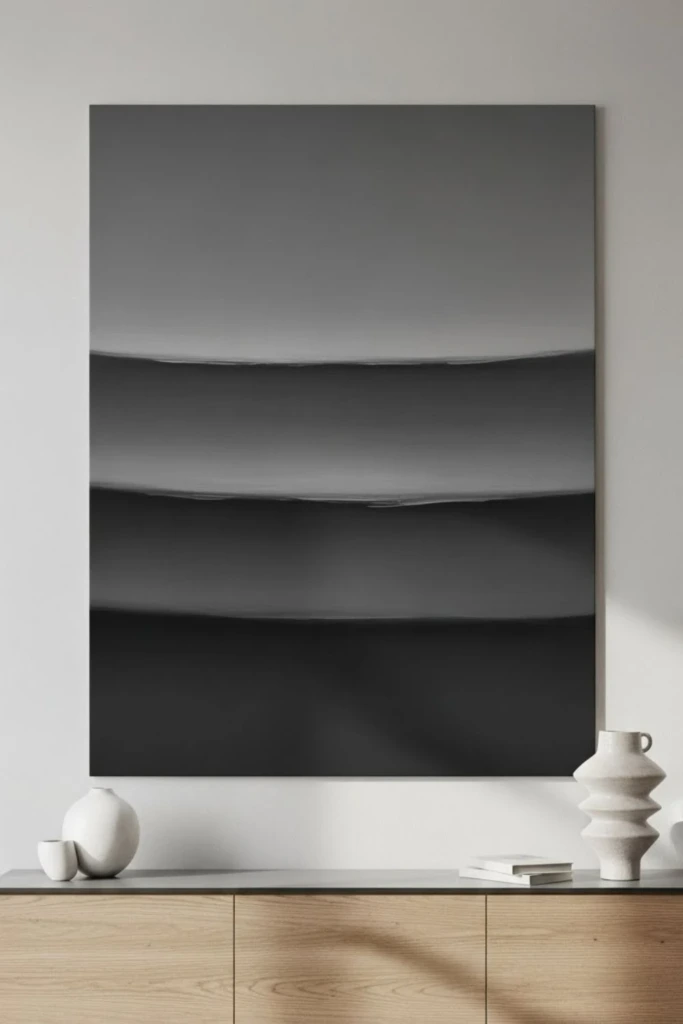
A monochromatic painting uses variations of one principal color to create a cohesive design. It is an excellent way to explore layering and texture without managing several unrelated shades.
Choose a base color such as blue, green, gray, or terracotta. Mix lighter and darker versions by adjusting the amount of white, black, or a compatible neutral. Apply these variations in broad strokes, translucent washes, and selectively blended areas.
You can make the composition more interesting by alternating smooth sections with visible brush marks. Dry brushing can also reveal the texture of the canvas beneath the paint.
Although the color range is limited, differences in value and texture keep the design from appearing flat. Monochromatic art can complement both understated interiors and rooms that already contain strong colors.
12. Organic Balance
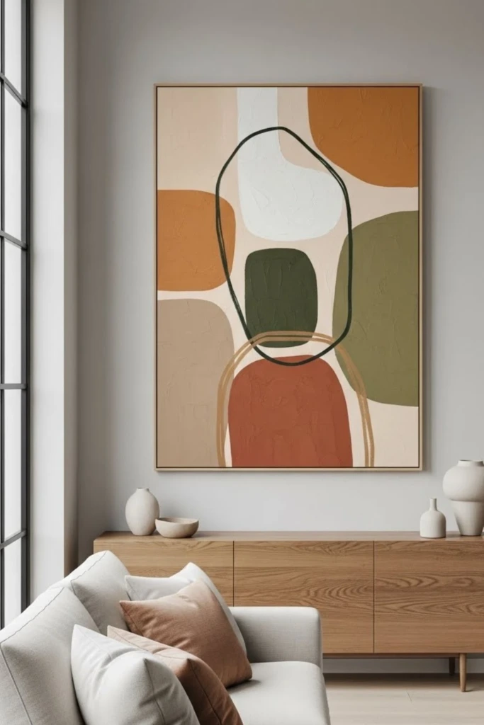
Organic abstract art takes inspiration from the irregular shapes found in nature. Rather than using rigid lines and perfectly measured sections, it combines rounded forms and flowing silhouettes.
Start with a few loosely sketched shapes, such as overlapping ovals, uneven circles, or curved patches of color. Let some forms intersect while leaving others separate. Vary their sizes and positions to create a natural sense of movement.
Terracotta, olive green, dusty pink, cream, and warm brown are appealing choices for an earthy palette. However, the same approach can work with brighter or cooler shades if they better suit your space.
Avoid making both sides of the canvas identical. An uneven arrangement often feels more lively and visually engaging than a perfectly mirrored design.
13. Minimal Geometry
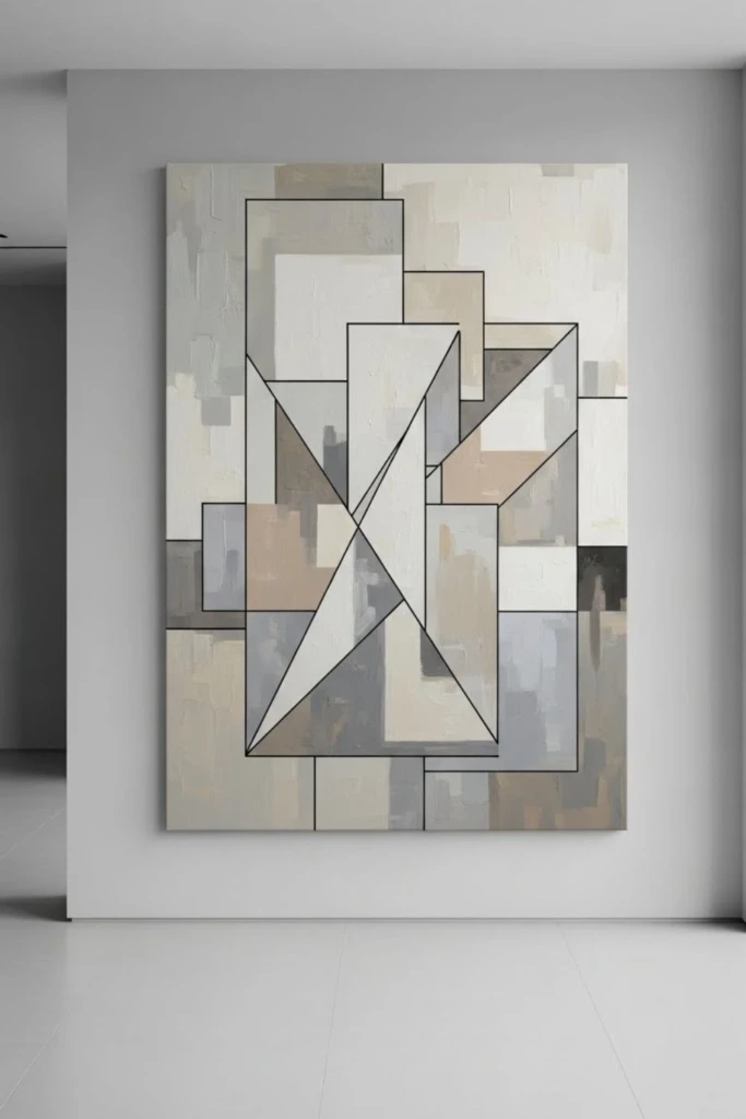
For a balanced mix of simplicity and structure, combine a loosely painted background with a small number of geometric shapes. The contrast between expressive brushwork and defined forms gives the artwork a distinctive modern appearance.
Create the background using blended acrylic paint, sponge marks, or broad brushstrokes. After it has dried, add one or two recognizable shapes, such as a circle, arch, rectangle, or straight line.
You can paint these elements freehand or use a stencil for cleaner edges. Before committing to a position, cut the desired shape from paper and move it around the canvas until the arrangement looks balanced.
Choose colors that complement the background rather than compete with it. The result can be subtle and sophisticated or bold and graphic, depending on your palette.
14. Earthy Color Wash
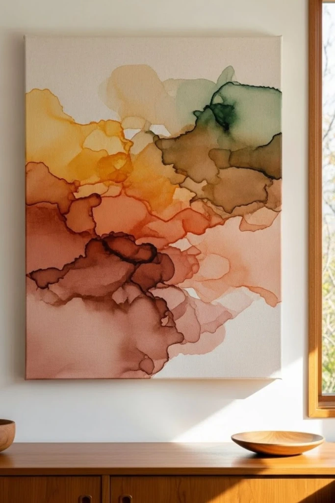
Acrylic color washes produce translucent layers that allow earlier colors and parts of the canvas surface to remain visible. This technique is ideal for creating artwork with a soft, atmospheric appearance.
Thin acrylic paint with an appropriate amount of water or acrylic medium, following the paint manufacturer's guidance. Brush the mixture across selected sections, allowing some areas to remain lighter than others. Build additional layers after the previous coats have dried enough to prevent unwanted mixing.
Warm brown, muted rust, clay, beige, and olive green work well for an earthy composition. You can let colors overlap naturally or use gentle brush movements to connect them.
Avoid trying to make every boundary perfectly smooth. Uneven transitions and variations in transparency often give a color-wash painting its distinctive character.
15. Asymmetrical Focus
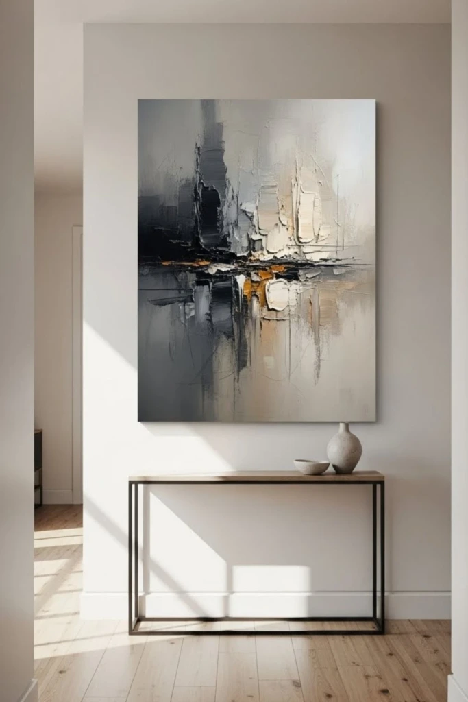
An asymmetrical composition creates visual interest by placing its strongest feature away from the center. Instead of arranging everything evenly, you use differences in size, color, and texture to guide the viewer's attention.
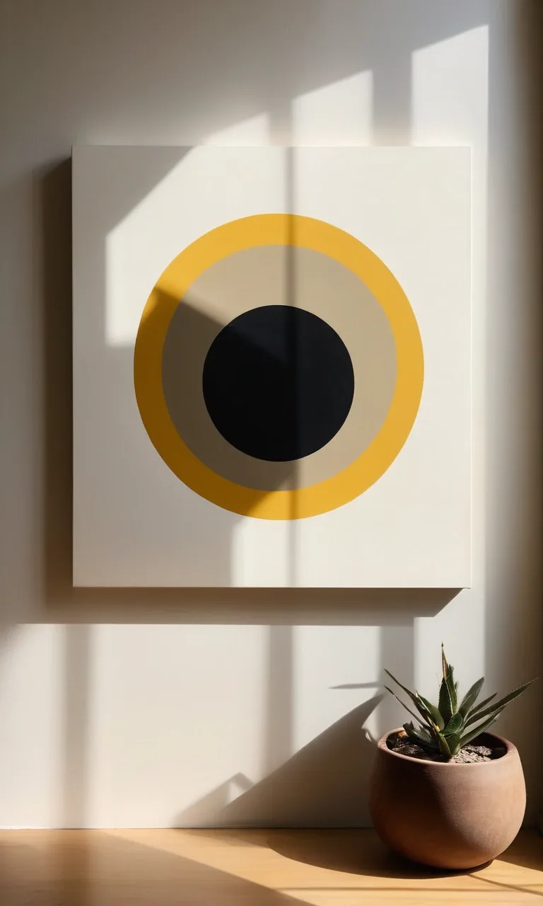
Choose one prominent element, such as a dark painted area, an oversized curved shape, or a textured patch. Position it slightly to one side of the canvas rather than directly in the middle.
Then introduce a few smaller marks elsewhere to counterbalance the dominant feature. These supporting details might repeat a color from the main shape or create a subtle directional flow across the surface.
Step back regularly to check how the composition feels from a distance. If one side appears too heavy, adjust the placement or intensity of the supporting marks rather than automatically adding more paint.
This approach creates artwork that feels thoughtfully arranged while preserving the spontaneity of abstract painting.
16. How to Make Abstract Art Look More Intentional
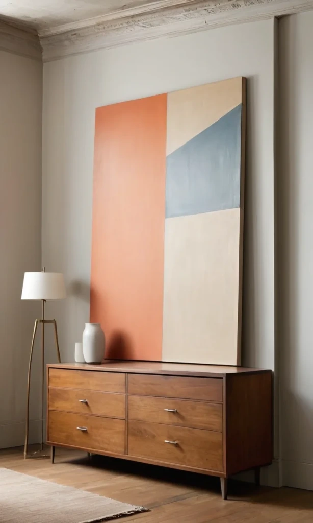
Abstract art allows experimentation, but a few simple design principles can make the finished canvas feel more cohesive.
Repeat selected elements. Reusing a particular color, shape, or type of brushstroke in several places creates a connection between different parts of the composition. Repetition gives the eye something familiar to follow without requiring every element to look identical.
Balance detailed areas with open space. Avoid giving every section the same amount of attention. A textured or colorful focal area becomes more noticeable when surrounded by quieter portions of the canvas.
Establish a focal point. Decide which part of the painting should attract attention first. You can emphasize that area through stronger contrast, a larger shape, richer color, or more pronounced texture. Let the remaining elements support rather than compete with it.
Limit your color palette. A small group of related colors often produces a more unified result than numerous unrelated shades. If you want to introduce a new color, test it on a spare surface before applying it to the canvas.
View the painting from different angles. Turn the canvas sideways or upside down to see whether the arrangement works better in another orientation. Looking at the painting from across the room can also reveal imbalances that are difficult to notice up close.
Finally, take breaks between painting sessions. Returning with fresh eyes helps you identify which areas need adjustment and which details are already working well.
What paint is easiest for DIY abstract canvas art?
Acrylic paint is generally one of the most convenient options for beginners. It is widely available, works on prepared canvases, and dries relatively quickly compared with many traditional oil paints.
You can apply it directly for solid blocks of color and textured strokes or dilute it appropriately to create transparent effects. Acrylics also allow you to build additional layers without waiting several days for each coat to dry.
For your first project, start with a small selection of colors and a few basic brushes. Add specialized products such as modeling paste or acrylic medium once you become comfortable with the fundamentals.
What colors should I use for an abstract painting?
Choose colors based on the atmosphere you want to create and the setting where the artwork will be displayed.
Warm neutrals, muted greens, and earthy browns can create a relaxed, natural appearance. Blues and grays often produce a cooler, calmer effect, while saturated reds, yellows, and oranges can make a composition feel energetic.
Look at the furniture, textiles, and decorative objects already present in the room for inspiration. You do not have to match every shade exactly. Selecting one or two colors that appear elsewhere in the space and pairing them with a neutral is usually enough to establish a visual connection.
If you are uncertain, test your combinations on scrap paper or a spare canvas before beginning the final piece.
How do I know when an abstract painting is finished?
There is no universal stopping point because abstract art depends on personal preference and the effect you want to achieve. However, a painting may be ready when its colors work together, the focal point is clear, and the composition feels balanced.
Put the canvas aside for a short time, then examine it from several feet away. Ask yourself whether another mark would genuinely improve the design or whether you simply feel uncomfortable leaving some space empty.
If the main shapes already stand out and the supporting details feel connected, additional paint may not be necessary. Remember that simplicity is a design choice, not a sign that you have failed to finish the artwork.
Allow the paint to dry fully before handling or hanging the canvas. If you decide to use a protective varnish, make sure the paint is sufficiently cured and follow the product instructions.
17. A Few Things to Remember
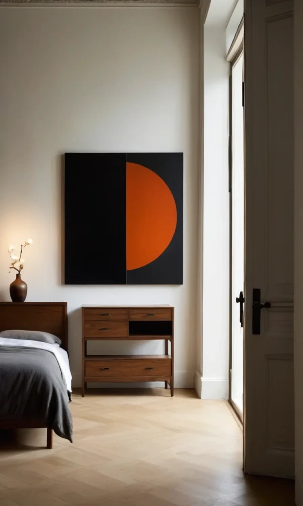
Making abstract canvas art at home is an opportunity to discover your own creative preferences rather than follow strict rules. Your first painting does not need to look professionally produced to be meaningful or attractive.
Begin with a manageable design, choose a limited palette, and experiment with techniques that interest you. Explore bold shapes, loose lines, subtle color transitions, or raised textures until you find combinations that feel right.
Give each layer time to develop, leave some areas uncluttered, and take breaks whenever you feel tempted to keep adding details. Every canvas you create can teach you something about color, movement, and composition.
Most importantly, enjoy the process. A simple handmade painting that suits your space and reflects your personality can be more satisfying than an elaborate design created by following someone else's style exactly.